直方图
直方图基本上用于表示以某些组的形式提供的数据。它是数字数据分布的图形表示的准确方法。它是一种条形图,其中 X 轴表示 bin 范围,而 Y 轴给出信息关于频率
要创建直方图,第一步是创建范围的 bin,然后将整个范围的值分布到一系列间隔中,并对落入每个间隔的值进行计数。Bins 清楚地标识为连续的、非变量的重叠区间。matplotlib.pyplot.hist() 函数用于计算和创建 x 的直方图。
matplotlib.pyplot.hist(): https://matplotlib.org/stable/api/_as_gen/matplotlib.pyplot.hist.html#matplotlib.pyplot.hist
基本案例
from matplotlib import pyplot as plt

y = [10, 5, 8, 4, 2]

plt.hist(y)

plt.show()

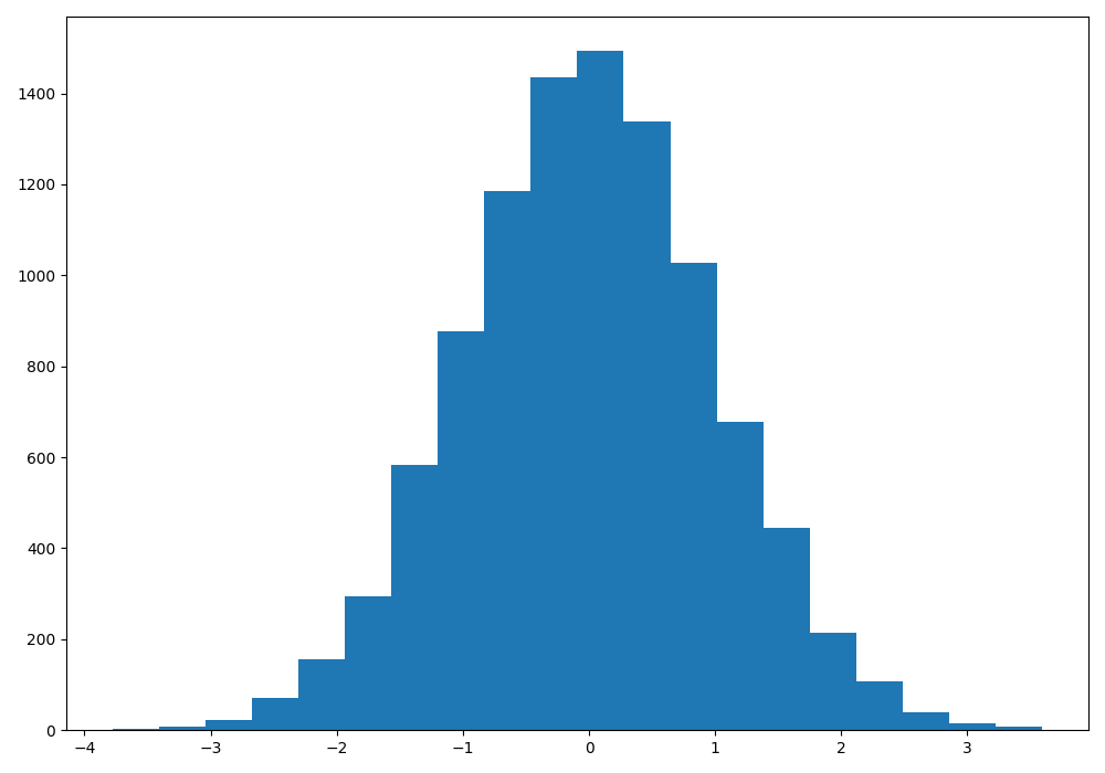
一维直方图
import matplotlib.pyplot as plt
import numpy as np

np.random.seed(23685752)
N_points = 10000
n_bins = 20

x = np.random.randn(N_points)
y = .8 ** x + np.random.randn(10000) + 25

fig, axs = plt.subplots(1, 1,
                        figsize =(10, 7),
                        tight_layout = True)

axs.hist(x, bins = n_bins)

plt.show()
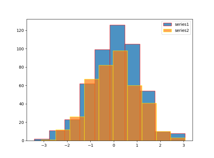
设置透明度和边框颜色
import matplotlib.pyplot as plt
import numpy as np

series1 = np.random.randn(500, 1)
series2 = np.random.randn(400, 1)

plt.hist(series1, label='series1', alpha=.8, edgecolor='red')

plt.hist(series2, label='series2', alpha=0.7, edgecolor='yellow')
plt.legend()

plt.show()
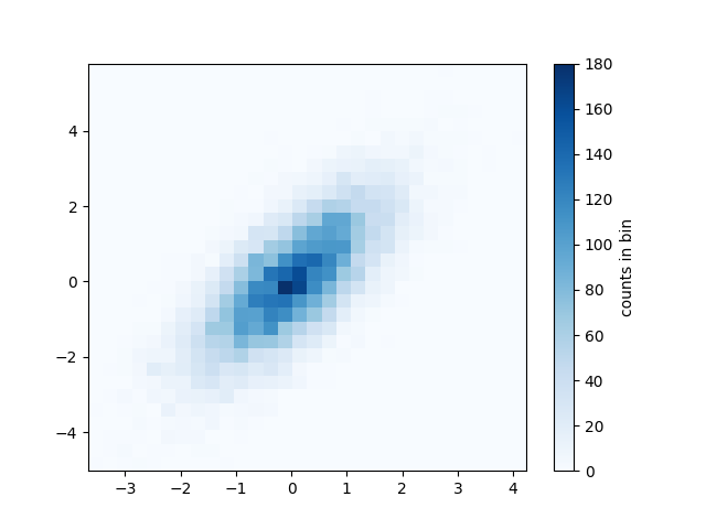
二维直方图
正如前面我们可以在一维上使用数值对应的直线划分桶一样,我们也可以在二维上使用数据对应的点来划分桶。绘制二维直方图最直接的方法是使用 Matplotlib 的plt.hist2d函数
import matplotlib.pyplot as plt
import numpy as np

mean = [0, 0]
cov = [[1, 1], [1, 2]]
x, y = np.random.multivariate_normal(mean, cov, 10000).T

plt.hist2d(x, y, bins=30, cmap='Blues')
cb = plt.colorbar()
cb.set_label('counts in bin')

plt.show()
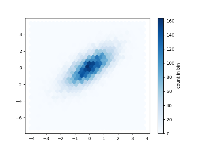
plt.hexbin:六角形分桶
刚才的二维分桶是沿着坐标轴将每个桶分为正方形。另一个很自然的分桶形状就是正六边形。对于这个需求,Matplotlib 提供了plt.hexbin函数,它也是在二维平面上分桶展示,不过每个桶(即图表上的每个数据格)将会是六边形:
import matplotlib.pyplot as plt
import numpy as np

mean = [0, 0]
cov = [[1, 1], [1, 2]]
x, y = np.random.multivariate_normal(mean, cov, 10000).T

plt.hexbin(x, y, gridsize=30, cmap='Blues')
cb = plt.colorbar(label='count in bin')

plt.show()