一个简单的例子
案例
# 导入matplotlib的包
import matplotlib.pyplot as plt

# 初始化数据
x = [10, 20, 30, 40]
y = [20, 30, 40, 50]

# 绘制数据
plt.plot(x, y)

# 设置图像标题
plt.title("Simple Plot")

# 增加X轴,Y轴的标签
plt.ylabel("y-axis")
plt.xlabel("x-axis")

# 显示图片
plt.show()
运行代码后的效果如下:
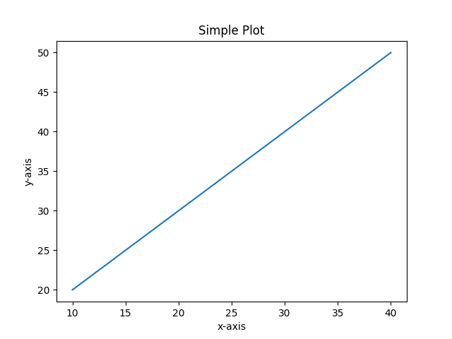
上述代码中,X和Y的元素提供了x轴和y轴的坐标,并根据这些坐标绘制了一条直线。
Pyplot是一个Matplotlib 模块,提供类似 MATLAB 的界面。 Pyplot 提供与图形交互的功能,即创建图形、使用标签装饰绘图以及在图形中创建绘图区域。
语法如下:
matplotlib.pyplot.plot(*args, scalex=True, scaley=True, data=None, **kwargs)
其他说明:
plot(x,y)-- 画x和y, 默认是线图plt.title()-- 用于设置图像的名字plt.xlabel()-- 用于设置X轴的标签plt.ylabel()-- 用于设置Y轴的标签plt.legend()-- 用于显示图例
更多API文档请查看matplotlib.pyplot.plot
Matplotlib 中图例plt.legend()有很多其他的用法,用于实现各种各样的图例要求,具体请参考官方文档:Legend Guide
tip
如果你使用的是IPython Notebook,想在Notebook文档中嵌入Matplotlib画出来的图像,请在Notebook最开始中加入如下代码:
%matplotlib inline
保存图片
Matplotlib的一个优点是能够将图形保存为各种不同的数据格式。你可以用savefig()命令将图形保存为文件。例如,如果要将图形保存为 PNG格式,则上述案例的代码可以改为:
# 导入matplotlib的包
import matplotlib.pyplot as plt

# 初始化数据
x = [10, 20, 30, 40]
y = [20, 30, 40, 50]

# 绘制数据
plt.plot(x, y)

# 设置图像标题
plt.title("Simple Plot")

# 增加X轴,Y轴的标签
plt.ylabel("y-axis")
plt.xlabel("x-axis")

# 保存图片
# plt.show()
plt.savefig("mygraph.png")
显示图例
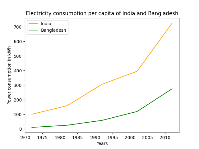
如果是一张图上显示两个曲线,并且显示图例以示区别该怎么办呢?代码如下:
import matplotlib.pyplot as plt

# year contains the x-axis values
# and e-india & e-bangladesh
# are the y-axis values for plotting
year = [1972, 1982, 1992, 2002, 2012]
e_india = [100.6, 158.61, 305.54, 394.96, 724.79]
e_bangladesh = [10.5, 25.21, 58.65, 119.27, 274.87]

# plotting of x-axis(year) and
# y-axis(power consumption)
# with different colored labels of two countries

plt.plot(year, e_india, color ='orange',
         label ='India')

plt.plot(year, e_bangladesh, color ='g',
         label ='Bangladesh')

# naming of x-axis and y-axis
plt.xlabel('Years')
plt.ylabel('Power consumption in kWh')

# naming the title of the plot
plt.title('Electricity consumption per capita\
 of India and Bangladesh')

# show legend
plt.legend()
# show image
plt.show()
结果如下: